
How to Decrease Bounce Rate: Effective Tips for Better Engagement
Learn how to decrease bounce rate with proven strategies to boost your website engagement and improve conversions. Click here for expert advice!
What Your Bounce Rate Is Really Telling You
Before you rush off to slash your website's bounce rate, let's pause for a moment. It's important to first understand what this number is actually communicating. A high bounce rate isn't automatically a red flag; in some cases, it can even be a sign that you're doing things right.
Think about it: a visitor lands on your "Contact Us" page, finds your phone number in two seconds, and leaves. Technically, that's a bounce. But in reality, it's a success! They found exactly what they needed, mission accomplished. The problem starts when visitors leave out of frustration, not satisfaction. A bounce becomes a real issue when someone hits your product page and leaves because it’s a confusing mess, or they ditch your blog post because it’s an intimidating wall of text. The goal isn't just to lower a percentage-it's to figure out the why behind each bounce.
Good Bounce vs. Bad Bounce: Reading the Signs
To really understand your bounce rate, you need to look at the context. A 70% bounce rate on a focused blog post might be perfectly fine, especially if the average time on page is high. This suggests people are reading your content thoroughly before moving on. However, a 70% bounce rate on your e-commerce checkout page is a massive warning sign. It signals a critical problem-like a broken payment button or unexpected shipping costs-that is actively losing you sales.
The trick is to pair your bounce rate with other key metrics to see the complete story. Here are a few things to check:
- Time on Page: A high bounce rate combined with a very low time on page (think under 10 seconds) often means there's a disconnect between what the visitor expected and what your page delivered.
- Traffic Source: Are visitors from a specific ad campaign bouncing more than others? Your ad copy might be setting the wrong expectations.
- New vs. Returning Visitors: New visitors tend to have higher bounce rates, which is normal. But if your returning visitors are bouncing, that's a stronger signal that something about your site's core experience needs fixing.
Benchmarking Against Reality, Not Just Numbers
Before you can set a realistic goal, it helps to know what a "normal" bounce rate looks like for different types of websites. It’s all about perspective.
Below is a table that breaks down average bounce rates across various industries. Use this to gauge where you stand and what a reasonable target might be for your specific site.
| Website Type | Average Bounce Rate | Good Range | Concerning Range |
|---|---|---|---|
| E-commerce & Retail | 20-45% | Below 35% | Above 50% |
| B2B / SaaS | 25-55% | Below 40% | Above 60% |
| Lead Generation | 30-55% | Below 45% | Above 60% |
| Content Websites | 35-60% | Below 50% | Above 70% |
| Landing Pages | 60-90% | Below 70% | Above 90% |
| Blogs | 65-90% | Below 75% | Above 90% |
| Portals / News | 10-30% | Below 20% | Above 35% |
This table shows just how much "good" can vary. A blog can have a high bounce rate and be perfectly healthy, while an e-commerce site needs that number to be much lower to succeed.
Comparing your site to major players also offers valuable insights. For example, YouTube has a low bounce rate of around 34.29% because its entire design is built to keep you clicking from one video to the next. In contrast, Google, the world's most visited site, has a higher bounce rate of 43.44% because its primary job is to send you away to other websites. You can find more details by exploring these global bounce rate statistics.
This infographic helps visualize how to position your own bounce rate against industry averages and your internal goals.
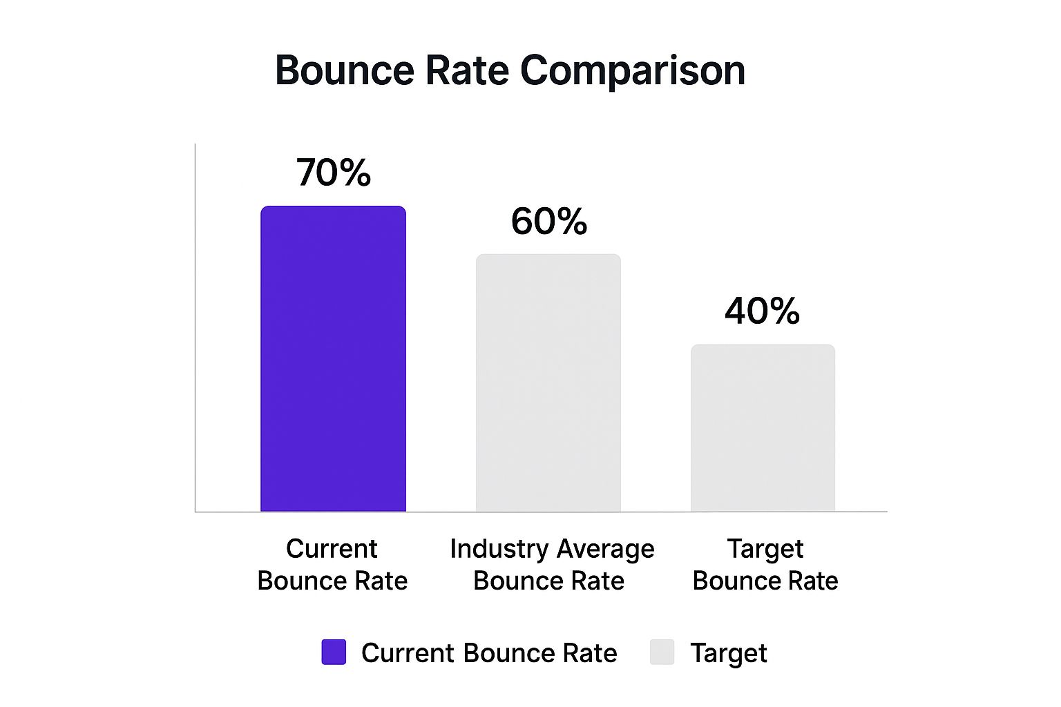
When you see your numbers in this context, the focus shifts from chasing an arbitrary percentage to setting a clear, meaningful target for improvement.
Making Your Site Fast Enough To Keep Visitors Around
Let’s talk about a silent killer of user engagement: slow loading times. Nothing makes a visitor hit the "back" button faster than a page that seems to take forever to appear. It's an instant turn-off, and it’s probably costing you more visitors than you realize. One of the most direct ways to decrease your bounce rate is to speed up your website, and the data on this is undeniable.
A recent report projects that by 2025, a whopping 46% of users will abandon a site if it takes more than 4 seconds to load. That’s nearly half of your potential audience, gone before they even get a chance to see what you have to offer. You can dive deeper into these website engagement statistics to see just how important speed has become. This means even a one or two-second improvement can make a huge difference in keeping people around. The good news? You don’t need to be a coding expert to make some real progress.
Finding Your Biggest Speed Killers
Before you can fix the problem, you need to know what's causing it. This is where free tools like Google PageSpeed Insights or GTmetrix become your best friends. They'll scan your site and give you a detailed report card, highlighting exactly what's slowing things down. These tools aren't just for developers; they provide clear, actionable suggestions that anyone can understand.
For example, a GTmetrix report might point out that you need to "Properly size images." This is a very common issue. The report will show a performance grade and key metrics like Largest Contentful Paint (LCP), giving you a clear starting point.

The report above shows a "Fully Loaded Time" of several seconds and a structure score that needs work-these are the exact clues you need to start optimizing. It even breaks down the problems into a prioritized list, so you know where to focus your energy for the biggest impact.
Quick Wins for a Faster Website
Once you have your report, you can start tackling the low-hanging fruit. Many of the most common speed issues can be fixed without hiring an expert.
Here are a few practical places to start:
- Image Optimization: This is almost always the main culprit. Large, uncompressed image files are heavy and take a long time to download. Use free online tools like TinyPNG or Squoosh to dramatically reduce file sizes without sacrificing quality. If you're using a platform like WordPress, plugins like Smush or Imagify can automate this for you.
- Lazy Loading: Implement lazy loading for your images and videos. This technique only loads media when it’s about to enter the user's viewport (the visible part of the screen). So, instead of loading every single image on a long blog post at once, they load as the user scrolls down, making the initial page load much faster.
- Reduce On-Page "Clutter": Every plugin, tracking script, and third-party widget adds to your site's loading time. It's time for an audit. Are you really using all those plugins? Can you get rid of that old social media feed widget no one clicks on? Each one you remove helps lighten the load.
Thinking Beyond Just the Homepage
Remember to check the speed of your most important pages, not just your homepage. A fast homepage is great, but if your product pages or key blog posts are sluggish, you'll still see high bounce rates on that critical content.
Pay special attention to your mobile site's performance. Since mobile devices often run on slower network connections, speed optimization is even more vital. A site that feels snappy on a desktop can feel frustratingly slow on a phone, which is where a huge chunk of your traffic comes from.
Optimizing your site's loading speed is a fundamental step toward keeping visitors engaged. For more in-depth guidance, you can explore these website speed optimization tips. Tackling these issues is a powerful, direct strategy for how to decrease your bounce rate and create a much better experience for every single visitor.
Writing Content That Hooks Visitors From The First Line
 Once you've made sure your site loads in a snap, the next major hurdle is the content itself. A speedy website that doesn’t deliver on its promises is just a quicker way to let a visitor down. The real secret to decreasing your bounce rate isn't about churning out more words; it's about writing with purpose. It's about instantly confirming to visitors that they've clicked on the right link and are in the perfect place to find what they need.
Think of your page's headline and opening paragraph as a deal you're making with the visitor. The link they clicked, whether from a search result or a social media post, set an expectation. You have roughly three seconds to show them you're going to honor that deal. If your headline is "5 Easy Ways to Pot a Plant," the very first thing your visitor should see is a direct path to those five methods-not a long-winded story about your lifelong passion for gardening.
This approach is known as the inverted pyramid, a classic technique borrowed from journalism. You lead with the most important information-the conclusion or the direct answer-right at the top. From there, you gradually work your way down to more detailed and supporting info for those who want to learn more. This structure is perfect for the two main types of web users: the "scanners" who just want a quick answer, and the "deep divers" who want to understand all the details.
Structuring Content for Scanners and Deep Divers
Let's make this practical. Say you're writing a blog post about how to choose the right running shoes. A bounce-proof structure would look something like this:
- The Hook (First 100 words): Get straight to the point. "The best running shoe for you boils down to three key things: your foot arch, the surface you run on, and your usual distance. Here’s a quick table to help you find your match." Bam. You've delivered immediate value.
- The Details (The Body): Use clear H3 subheadings for each factor (e.g., "Understanding Your Foot Arch," "Choosing for Your Running Surface"). Under each heading, use short paragraphs and bullet points to break down the information. This lets scanners jump right to the section that's most relevant to them.
- The Depth (Further Down): After you've covered the basics, you can add sections like "Advanced Gait Analysis Explained" or "Top Brands for Every Foot Type." This is where your deep divers will happily spend their time, but it's positioned so it doesn't obstruct the scanners who needed a fast solution.
This method respects your visitor's time. Research often shows that people don't leave a page because the information isn't there; they leave because it's buried and too difficult to find. A well-organized page with clear headings, bolded terms, and bullet points works like a roadmap, guiding users straight to their destination.
Addressing Concerns and Building Trust
Good structure is only half the battle. Your content also needs to anticipate and answer your visitor's unspoken questions and worries. If you're selling something, what are their potential doubts? Is it complicated to set up? Is it really worth the price? What if it doesn't work for my specific situation? Weaving answers to these questions into your content, maybe in an FAQ section or through customer stories, builds trust and smooths out the friction that often causes bounces.
This is especially true for more complex services. Visitors might need instant answers about technical specs or specific use cases. An on-site assistant is a great way to handle this. For example, if you're curious about providing immediate, detailed answers on your own site, our guide on how to create a helpful AI chatbot can give you some great ideas. This kind of interactive help can resolve specific queries instantly, turning would-be bounces into engaged prospects. By combining a clear content hierarchy with on-demand support, you create a powerful defense against a high bounce rate.
Creating User Experiences That Feel Effortless
When a visitor lands on your site, every single element-from the navigation bar to the font choice-sends a message. A cluttered, confusing design feels like walking into a messy room; it creates instant friction and sends people looking for the exit. The best user experience (UX) is practically invisible. It lets visitors find what they need without ever having to think about how to find it. Improving this experience is a powerful way to decrease your bounce rate, turning frustrated visitors into engaged explorers.
This doesn't mean you need a costly, ground-up redesign. Often, small, strategic tweaks can make a world of difference. Think about your website as a physical store. Is the front door (your homepage) easy to find? Are the signs (your navigation labels) clear and direct? If a visitor has to hunt for basic information, they won’t stick around for long.
From Confusion to Confidence: Small Changes, Big Impact
A common mistake is creating a design that looks good to you but feels confusing to a first-time visitor. For example, a creative but unconventional navigation menu might seem unique, but if users can't figure out where to click, they'll simply leave. The goal is to create clear pathways that match what your visitors are trying to do.
Think about the visual hierarchy of your page. Are the most important elements, like your main call-to-action button, visually dominant? Or are they lost in a sea of competing text and images? Using color, size, and spacing to guide the eye toward the most important actions is a core principle of good UX. A bright, clearly labeled "Get Started" button is far more effective than a muted one buried at the bottom of the page. This clarity builds visitor confidence and encourages them to take the next step.
Typography, Spacing, and Trust
You might not see typography as a tool to lower your bounce rate, but it has a huge psychological effect. A page crammed with tiny, hard-to-read text is intimidating. It signals that engaging with your content will be hard work. In contrast, using a clean, readable font with generous line spacing and short paragraphs makes your content feel approachable and easy to digest. This simple change can make visitors feel more relaxed and willing to read what you have to say.
White space, or negative space, is another key element. It’s the empty area around your text and images. Using white space effectively reduces cognitive load, making your page feel less cluttered and more focused. This helps users absorb information more easily and keeps them from feeling overwhelmed.
To give you a clearer picture, I've put together a table showing how specific UX improvements can influence your bounce rate and what it takes to implement them.
UX Elements Impact on Bounce Rate
Data showing how specific design elements and user experience factors affect visitor engagement and bounce rates
| UX Element | Impact on Bounce Rate | Implementation Difficulty | Expected Results Timeline |
|---|---|---|---|
| Clear Navigation | High | Medium | 1-2 Months |
| Mobile-First Design | High | High | 2-3 Months |
| Readability | Medium | Low | 1-2 Weeks |
| White Space | Medium | Low | 1-2 Weeks |
This table shows that even low-effort changes like improving readability and white space can yield results in just a couple of weeks. Higher-impact items like a mobile-first design take more time but are critical for long-term success.
Ultimately, a smooth user experience comes down to empathy. It’s about seeing your website through your visitor's eyes and removing the small hurdles that cause frustration. Even the way you customize on-site tools can make a difference. For instance, ensuring your chatbot's design matches your brand's aesthetic creates a cohesive, trustworthy feel. You can learn more about this by checking out our documentation on how to update chatbot settings to match your brand. By focusing on these seemingly small details, you build a site that not only welcomes visitors but also convinces them to stay.
Building Navigation That Naturally Guides Exploration

A great user experience goes beyond a single page; it's about the entire journey. What separates a visitor who reads one article and leaves from one who spends twenty minutes exploring your site? Often, it’s your navigation. Your mission is to make finding the next useful piece of content feel like a natural suggestion, not a dead end. This is where a smart internal linking strategy becomes a core part of how you decrease your bounce rate.
Think of your website's navigation as a helpful librarian. A visitor shows up looking for a specific book (your landing page), but a good librarian knows to point them to the whole section on that topic, related authors, and new releases they might enjoy. Your site structure should do exactly that. It should anticipate what the user might want next and make it incredibly easy for them to find it.
Creating Pathways, Not Dead Ends
Effective navigation is more than just a menu at the top of the page. It’s about building a web of logical connections throughout your content. One of the best ways to do this is with contextual internal links. These are links you place naturally within your text that point to other relevant pages on your site. For instance, if you're discussing a product feature, you can link directly to a case study showing that feature in action.
You also shouldn't overlook the power of a well-organized "Related Posts" or "You Might Also Like" section at the end of your articles. This simple feature can reduce bounce rate significantly by giving engaged readers a clear next step.
Here are some key parts of a navigation system that encourages people to stick around:
- Logical Hierarchy: Your main navigation should be simple and predictable. Use broad categories that make immediate sense to a first-time visitor.
- Breadcrumbs: These are small navigational trails that show users where they are (e.g., Home > Blog > UX Design > This Article). They provide context and an easy way to move back up to a broader category.
- A Good Search Bar: A prominent and effective search function is vital, especially for larger sites. It acts as a safety net, letting users find exactly what they need if they can't spot it in the main navigation.
Analyzing Your Current Structure
To make things better, you first need to know where you stand. Jump into your analytics and look for pages with high exit rates. Are these pages dead ends with no clear next steps or internal links? These are your top priorities for an upgrade. Adding a few relevant internal links or a "related content" section to these pages can be a quick win.
The key is to think from your visitor’s perspective: after they finish with this page, what is the most logical thing they would want to know next? By providing that pathway, you can turn a potential bounce into a longer, more valuable visit.
Using Interactive Elements to Transform Passive Visitors
A fast site with great content and clear navigation sets the stage, but the final act in battling a high bounce rate is turning passive consumption into active participation. Let's be honest, static websites are starting to feel a bit like relics from a bygone era. Today's visitors expect an experience they can be a part of. Adding interactive elements is a solid way to decrease your bounce rate because it gives people a reason to click, type, and engage rather than just read and leave.
This isn't about adding flashy gimmicks for the sake of it. It's about delivering real value through interaction. Think of it this way: a static product page is like a brochure, but an interactive calculator that helps a visitor figure out their potential ROI is more like a personal consultation. The second option is far more likely to hold someone's attention and build their confidence in what you offer. This shift from passive to active is key to keeping people on your site longer.
Give Your Visitors a Job to Do
People feel more invested when they are part of the process. You can introduce interactive tools that not only capture attention but also help qualify your visitors, turning anonymous browsers into active participants.
- Quizzes: A simple quiz like "What's Your Marketing Style?" or "Which of Our Products Fits You Best?" can be surprisingly effective. It's fun, gives personalized results, and keeps users clicking through multiple steps on your site.
- Calculators: For B2B or e-commerce sites, tools like ROI calculators, pricing estimators, or savings calculators offer immediate, concrete value. A visitor who spends three minutes configuring a tool to see how much they could save is no longer a bounce risk; they're an engaged lead.
- Assessments: Try offering a free assessment tool that grades a visitor's website, marketing strategy, or another relevant area. This gives them personalized feedback and instantly positions you as an expert in your field.
The Rise of the Helpful AI Chatbot
One of the most powerful interactive tools you can use is an AI-powered chatbot. A modern chatbot, like those from Whisperchat.ai, isn't the annoying, script-following bot you might remember from a few years ago. It’s a 24/7 on-site expert trained on your specific documentation, product info, and website content.
Imagine a visitor lands on a complex pricing page. They have a specific question about a feature in your 'Growth' plan. Instead of getting frustrated and bouncing, they can ask the chatbot and get an instant, accurate answer. This single interaction can be the difference between a lost visitor and a new customer. It smooths out friction in real time. For businesses, the impact can be huge-users have reported reducing support ticket volume by up to 70% because the chatbot handles repetitive questions instantly.
The key is to make the chatbot helpful, not intrusive. You can set it to appear after a user has been on a page for a certain amount of time or shows signs of confusion, like moving their cursor toward the back button. By offering help at the exact moment of need, you turn a potential bounce into a positive, productive engagement. This approach not only slashes your bounce rate but also creates a more satisfying journey for your users from the very first click.
Tracking Progress And Optimizing For Long-Term Success
Improving your website isn't a project you can just "set and forget." The strategies you've put in place are meant to get the ball rolling, but the real key to keeping your bounce rate low for good is to see it as an ongoing process of learning and tweaking. This means shifting from one-off fixes to a continuous cycle of tracking, testing, and optimizing based on how real people behave on your site. Without a proper way to measure, you're just guessing, unable to know which changes are actually making a positive impact.
First things first, you need to establish a clear baseline. You have to know where you're starting from to see how far you've come. But just watching your overall bounce rate number drop isn't the whole story. You need to dig a bit deeper. For instance, a lower bounce rate is great, but if it also leads to less time on page and fewer conversions, you might have just swapped one problem for another. Real success is when a lower bounce rate is paired with positive movement in other key metrics.
Understanding The Full Story With Qualitative Data
Analytics tools are great at telling you what is happening-like which pages have the highest bounce rates-but they can't tell you why. This is where qualitative tools are a game-changer. They give you a peek into the user’s actual experience, helping you connect the numbers to human behavior.
- Heatmaps: These tools create a visual map of where users click, move their cursors, and scroll. A heatmap might show you that visitors are repeatedly clicking on an image that isn't a link, which is a clear sign of frustration.
- User Recordings: Watching anonymous session recordings is like looking over a visitor's shoulder. You can see precisely where they get stuck, where they hesitate, and the exact moment they decide to leave. This firsthand perspective is priceless for uncovering UX issues you would otherwise never notice.
By combining the quantitative data from your analytics with these qualitative insights, you get a much richer picture of your user experience. This combination is what allows you to form solid hypotheses for what you should test next. For a more detailed look at making your website traffic more effective, you might want to read a full guide on optimizing website traffic for conversion. This kind of resource can help you see how reducing bounces fits into the larger goal of getting more value from every visitor.
A Practical Framework For Continuous Optimization
Once you have a steady flow of data and insights, you need a system to act on them. A continuous optimization loop is a simple but effective way to make sure you’re always moving forward.
| Step | Action | Key Question to Ask |
|---|---|---|
| 1. Analyze | Review analytics, heatmaps, and session recordings weekly. | What are the biggest drop-off points? What new patterns are emerging? |
| 2. Hypothesize | Based on your analysis, form a clear hypothesis. | "I believe changing the CTA button color will increase clicks because..." |
| 3. Prioritize | Rank your hypotheses on potential impact and ease of implementation. | Which test could give us the biggest win with the least effort? |
| 4. Test | Implement one change at a time and A/B test if you can. | Did this change lead to a statistically significant improvement? |
| 5. Learn | Whether the test succeeded or failed, document your findings. | What does this result tell us about our users? How can we apply this? |
This structured approach stops you from making random changes based on a gut feeling. Every action is backed by data, and every outcome-good or bad-helps build a smarter strategy. It’s also important that your tools can keep up. For example, if you're using an AI chatbot, it needs to learn from your new content automatically. You can see how this works by checking out a guide on how to fetch data from URLs to ensure your on-site assistant is always up-to-date.
This long-term perspective is how you build a website that doesn't just stop visitors from bouncing but actually delights them, turning casual browsers into loyal customers.
Ready to transform passive visitors into active participants? Whisperchat.ai lets you deploy a smart AI assistant trained on your own content in minutes. It's the perfect tool to answer questions instantly, reduce friction, and start decreasing your bounce rate today. Explore Whisperchat.ai and start your free trial.